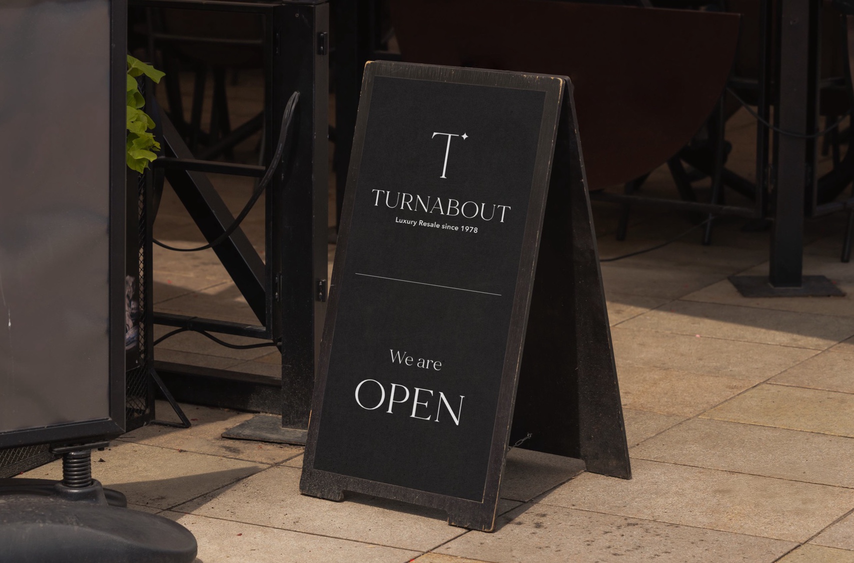
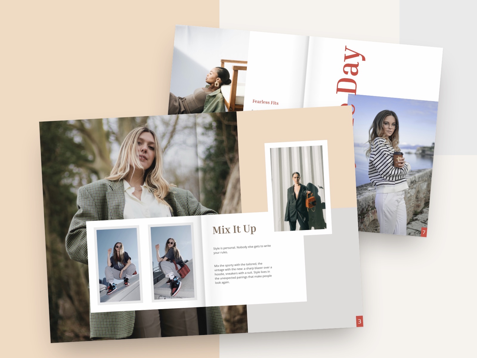
Turnabout
Brand Identity · Visual Design
A visual identity system for a luxury resale destination, spanning logo design, colour, typography, brand language and campaign applications.
- Role / Discipline
- Brand identity & visual design
- Type
- Portfolio project
- Deliverable
- Brand guideline
- Scope
- Logo · Colour · Typography · Brand language · Applications
01 — Overview
A cohesive identity for a luxury resale pioneer.
For nearly 50 years, Turnabout has been a pioneer in luxury resale, offering a curated selection of pre-owned designer fashion. With a growing online presence and ambitions to compete with global resale giants, it’s time to establish a cohesive brand identity that reflects its legacy and vision.
This brand guideline defines Turnabout’s visual and brand language, ensuring consistency across all touchpoints, from in-store experiences to digital platforms. By aligning its aesthetic with its values of elegance, sustainability and modern luxury, Turnabout will strengthen its position as a trusted destination for premium resale fashion.
02 — Vision & mission
Where the brand is going, and why.
- Vision
- To be the leading destination for luxury resale in Canada, offering a curated selection of premium fashion while promoting sustainability and conscious shopping.
- Mission
- Redefining luxury resale with an elegant, seamless shopping experience: connecting fashion enthusiasts with high-quality, pre-owned designer pieces, and fostering a community built on trust, sustainability and style.
03 — Logo
Wordmark and monogram.
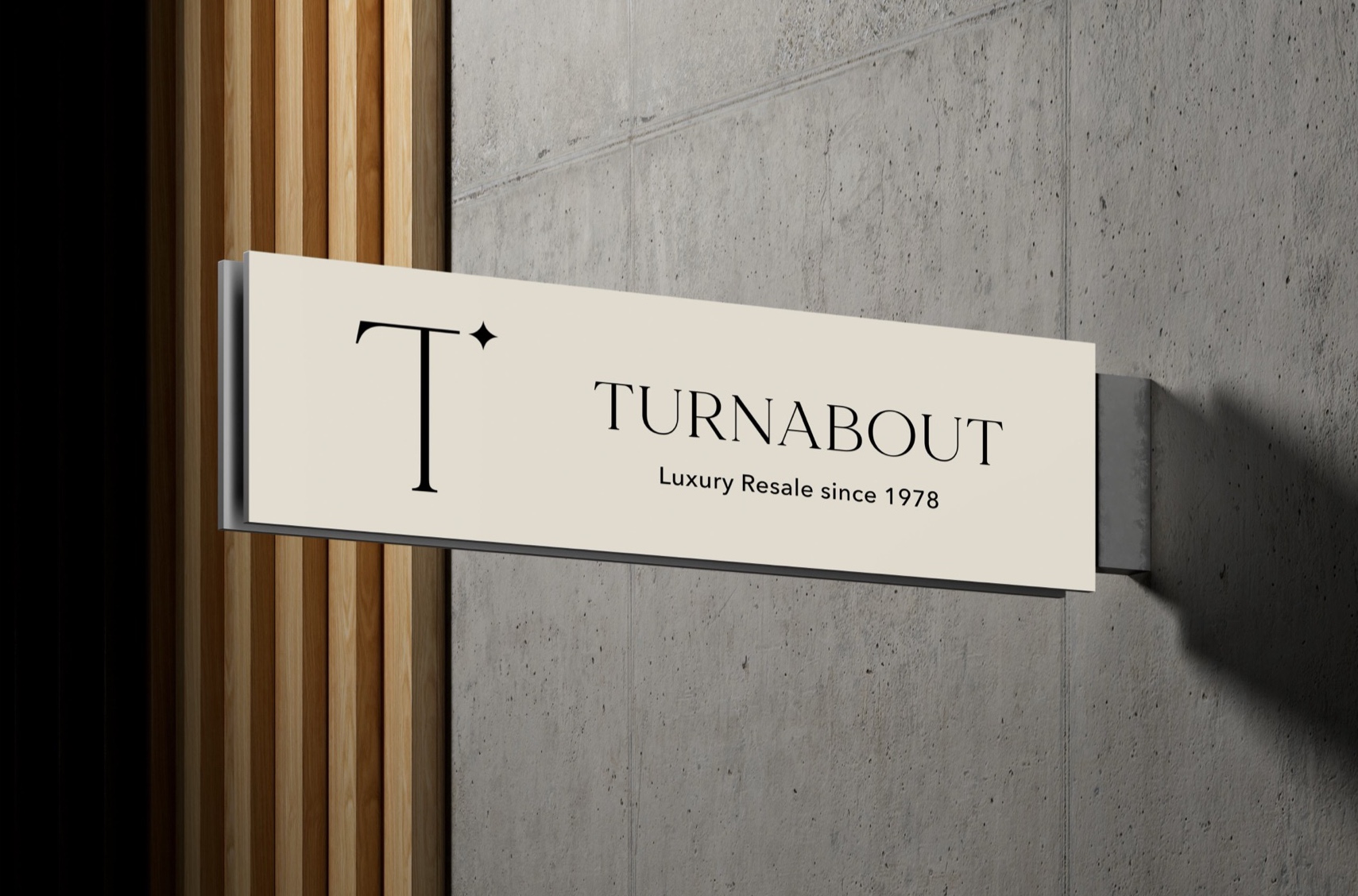
The TURNABOUT wordmark and the T monogram work as a pair, shown here across the four core brand colours: Black, Moon Mist, Gallery and Tuna.

04 — Core values
Five values the identity has to carry.
Authenticity
Every item is carefully authenticated to ensure quality and trust.
Sustainability
Giving luxury fashion a second life, reducing waste and supporting circular fashion.
Elegance
From store design to customer experience, striving for timeless sophistication.
Community
Celebrating the fashion-conscious community and encouraging shopping local, strengthening the connection between Turnabout and the neighbourhoods it serves.
Innovation
Expanding into digital spaces and embracing new ways to enhance the resale experience.
05 — Colour
Elegant, luxurious, still inviting.
Turnabout’s colour palette reflects its brand personality, conveying elegance and luxury while maintaining a modern, inviting aesthetic.
- Primary colours:
- the core brand colours used across marketing, digital and in-store branding.
- Accent colours:
- supporting hues for contrast and highlights.
- Colour usage:
- rules for applying colour consistently.
- Black#000000
- Moon Mist#DFD9CD
- Gallery#EAEAEA
- Tuna#313037
06 — Typography
A refined serif, paired with a clean sans.
Typography plays a crucial role in brand communication. These typefaces give Turnabout’s identity a cohesive visual language across all platforms.
- Primary — Made Mirage
- Headings and brand elements.
- Secondary — Avenir Next
- Body text and smaller details.

07 — Mockups & application
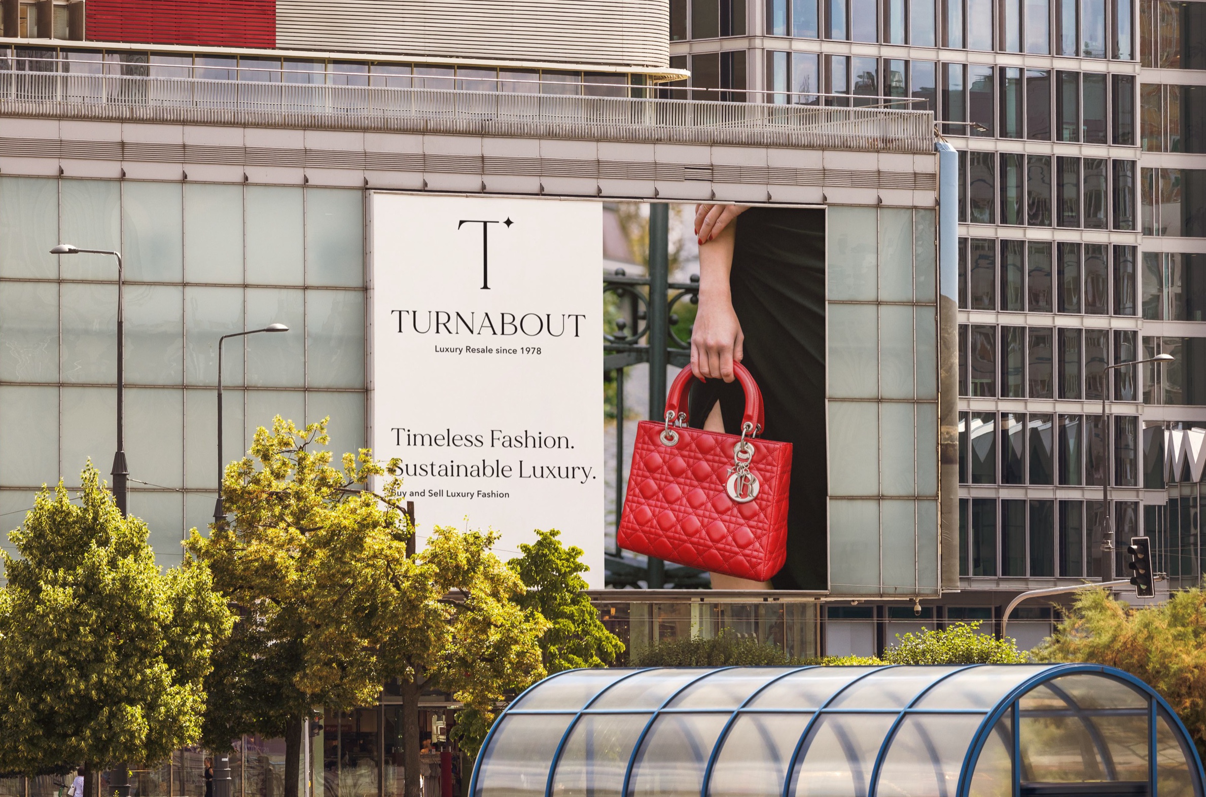
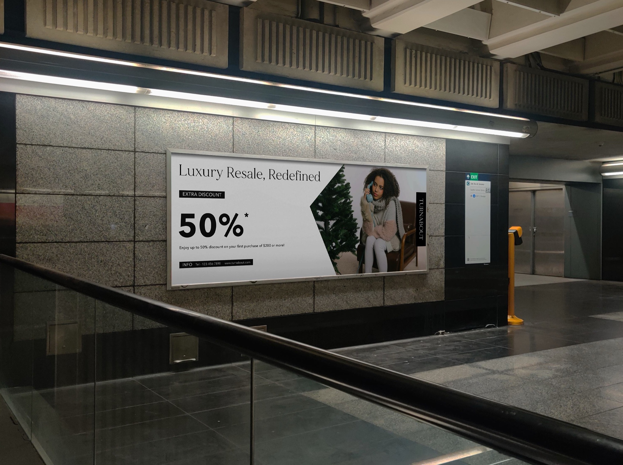
The identity at work, from shopping bag to billboard.
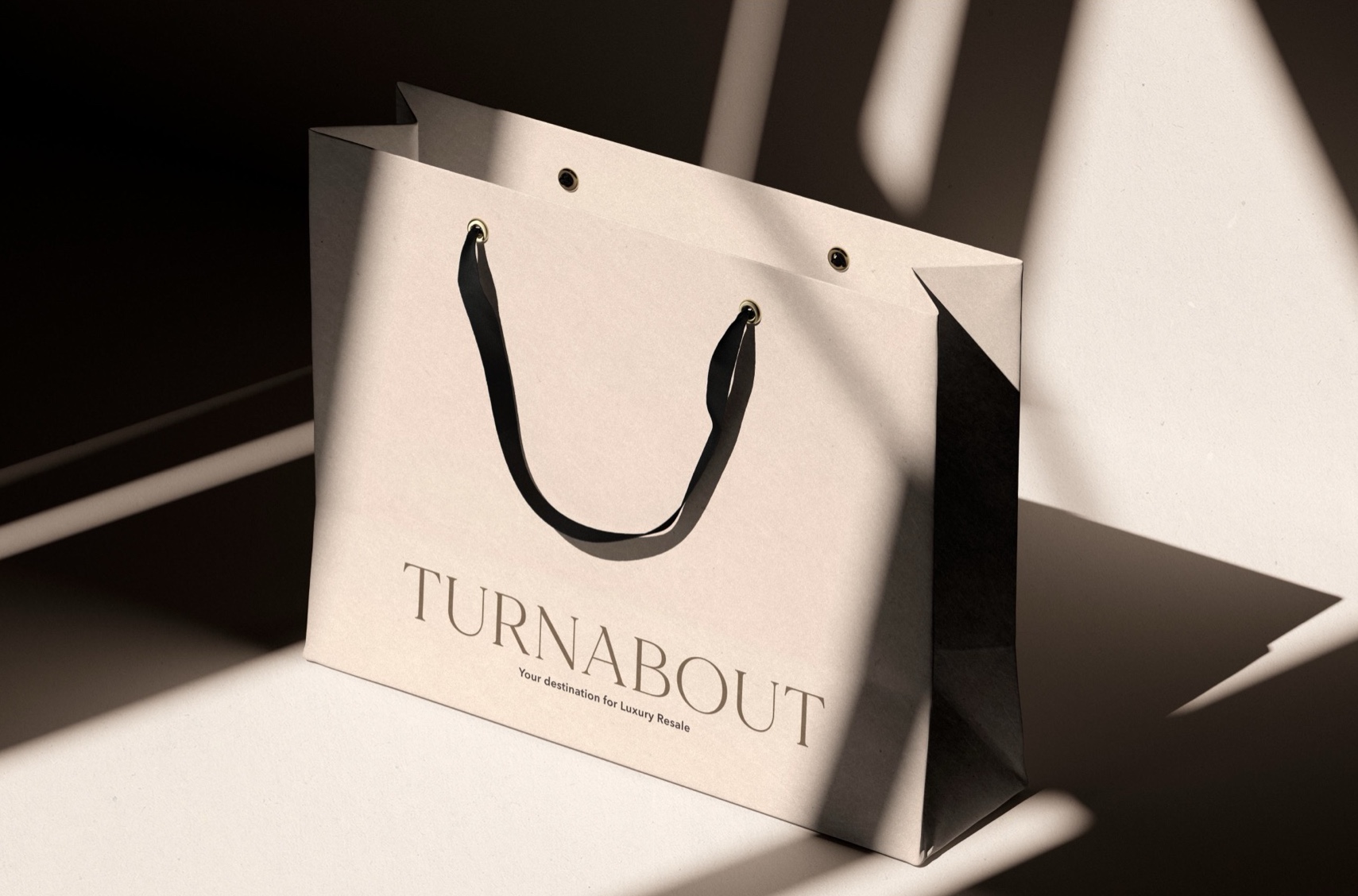
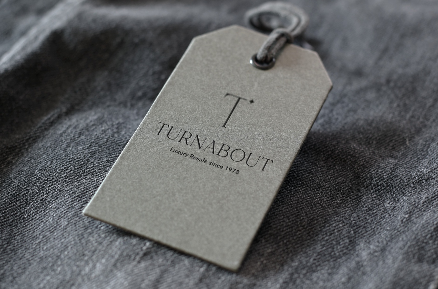
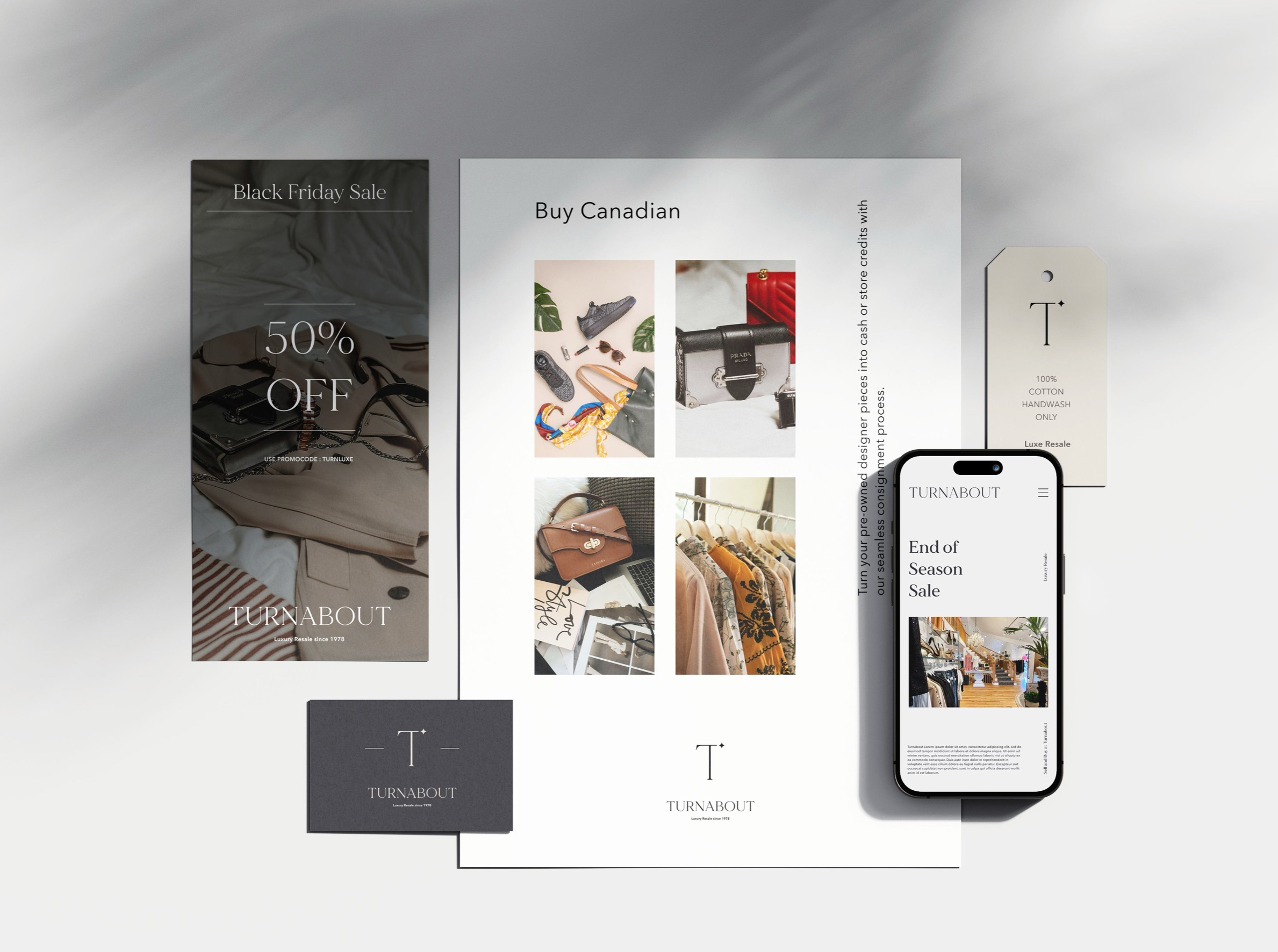
How Turnabout’s brand identity translates into real-world applications, keeping the brand consistent across every touchpoint.
- Business cards & stationery
- Branded print materials.
- Packaging & shopping bags
- Elegant, on-brand designs for the customer experience.
- Flyers & print ads
- Promotional materials aligned with the new identity.